Modal Popup’s
Modal Popup’s are overlay windows that appear on your website to display announcements, forms, and facilitate user interactions. They provide a versatile way to engage with your visitors and collect information directly on your site.
Key features of Modal Popup’s:
- Flexible content — Display any type of content including text, images, forms, and interactive elements
- Customizable design — Fully customize the appearance, styling, and layout to match your brand
- Multiple triggers — Use various activation triggers such as page load, scroll depth, timer, click events, and exit intent
- Targeted messaging — Show relevant content based on user behavior, location, or properties using render conditions
- Form integration — Collect user information through embedded forms for newsletter signups, contact forms, and more
- Responsive design — Automatically adapt to different screen sizes and devices
Common use cases for Modal Popup’s:
- Newsletter signup — Collect email addresses for your newsletter or marketing campaigns
- Contact forms — Gather contact information from interested visitors
- Survey — Create multiple choice surveys to collect user choices and feedback
- Product promotions — Show special offers, discounts, or promotional content to targeted audiences
- Announcements — Display important announcements, updates, or news to your visitors
- Exit intent — Display modals when users are about to leave your website to capture their attention
- Lead generation — Collect leads and contact information from potential customers
- Event registration — Allow users to register for webinars, events, or special activities
Step-by-step guide: Creating your Modal Popup
Follow this complete guide to create, customize, and track your Modal Popup from start to finish.
Step 1: Create your Modal Popup
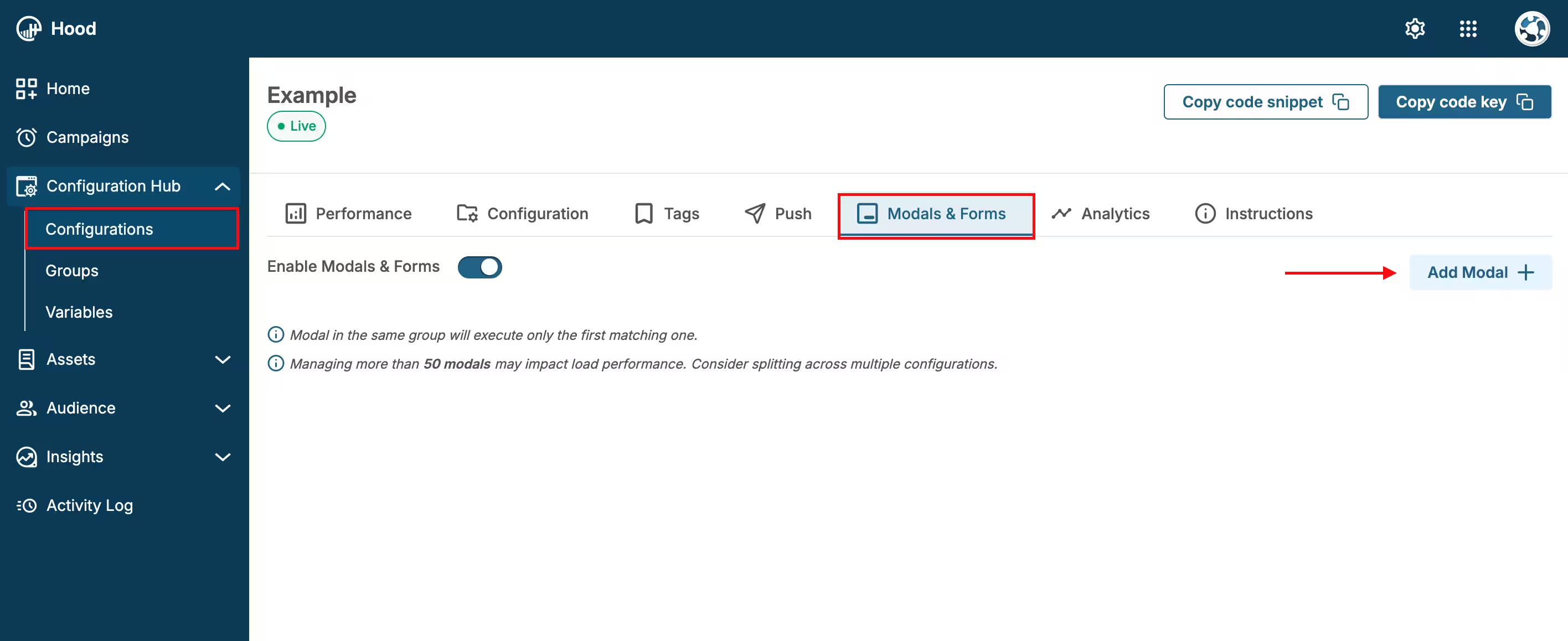
- Navigate to your Configuration in the HoodEngage dashboard
- Go to the Modals & Forms tab
- Click Add Modal
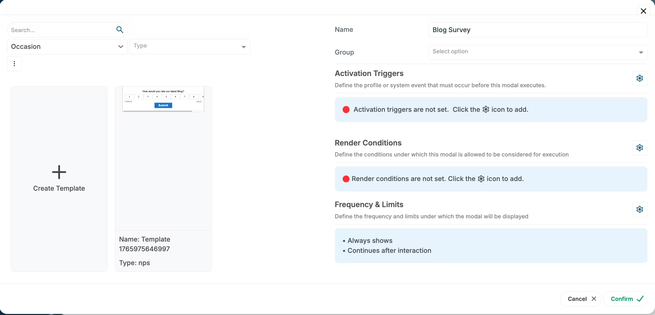
- Select Modal Popup as the modal type
- Choose to either:
- Use an existing template — Select from pre-built popup templates (newsletter, contact form, promotion, etc.)
- Create from scratch — Build a custom modal popup

Add Modal

Select an existing template or create a new template
Step 2: Configure content and design
Add your content:
- Text — Add text elements for headlines, body text, or descriptive messages
- Button — Add call-to-action buttons to guide user interactions
- Question — Add question elements to create surveys. Questions can have various answer types including: Short and long answer, Multiple choice, Checkbox, Poll, Mood meter, Linear scale, Star rating, Email, Number
- NPS — Add Net Promoter Score elements for satisfaction surveys
- Line — Add horizontal lines to separate content sections
- Image — Upload images or use media library assets to enhance visual appeal
- Video — Embed videos to provide rich multimedia content
- Social — Add social sharing buttons or social media integration
Customize the design:
- Choose colors, fonts, and styling that match your brand
- Add your logo or branding elements
- Set background overlay opacity
- Customize button styles and colors
- Adjust spacing and layout
Configure form fields (if applicable):
- Add required fields (email, name, etc.)
- Set field validation rules
- Customize field labels and placeholders
- Add submit button text
Preview your modal — Use the preview feature to see how it will appear to users

Example while editing in Studio
Step 3: Set up triggers and display conditions
Configure when and where your Modal Popup should appear. For detailed information about all available activation triggers and render conditions, see Triggers, Conditions, Frequency & Limits.
Step 4: Configure frequency and limits
Set how often your Modal Popup should be displayed to users. For detailed information about frequency options and limits, see Triggers, Conditions, Frequency & Limits.
Step 5: Activate and test
- Save your modal — Click Save to store your configuration
- Assign to configuration — Ensure the modal is assigned to the correct configuration
- Test the modal:
- Visit your website
- Trigger the modal based on your settings (e.g., scroll, timer, exit intent)
- Verify the display, content, and form functionality
- Test form submission and data collection
- Test on both desktop and mobile devices
- Verify responsive design on different screen sizes
Step 6: Monitor performance and feedback
Once your Modal Popup is live, track its performance:
- View performance metrics:
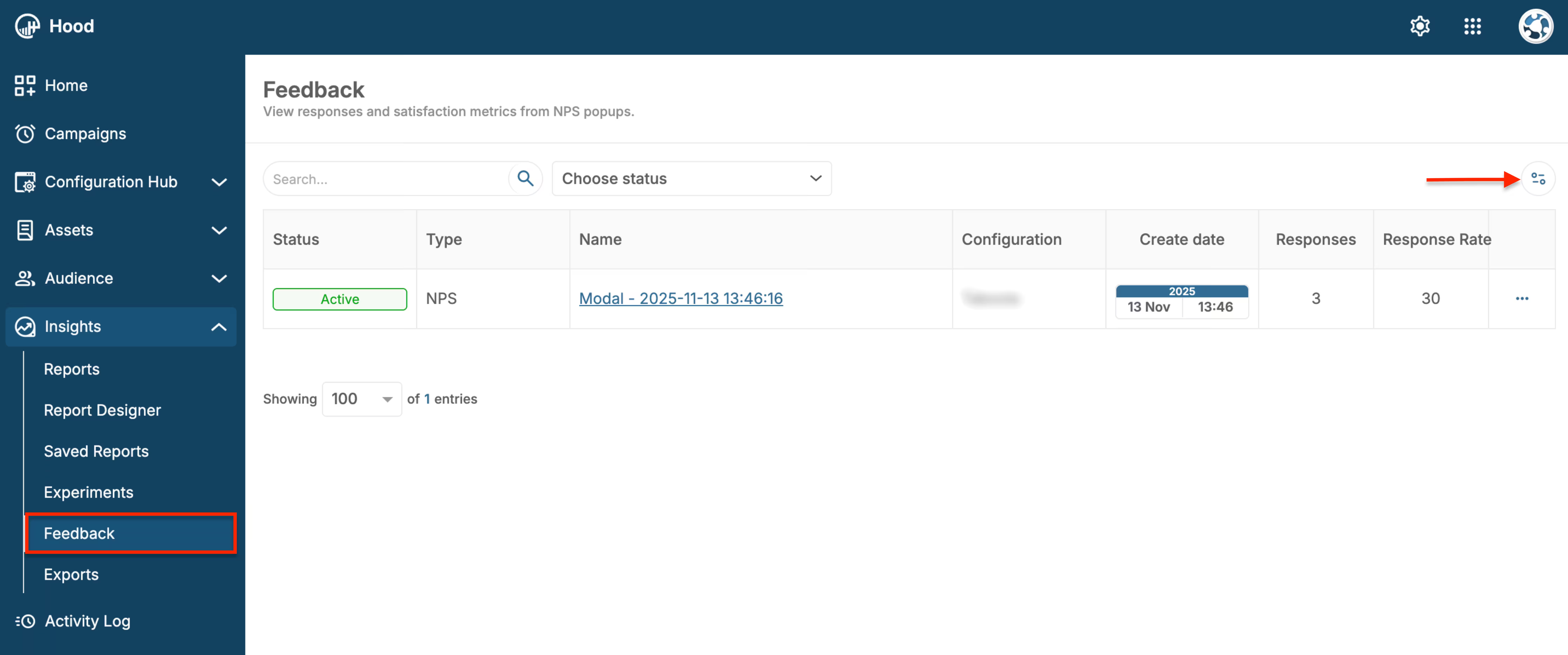
- Navigate to Insights → Feedback

Feedback page - Modals list
- Find your Modal Popup in the list
- View key metrics: Views, Responses, Response Rate, Conversion Rate
Analyze engagement:
- Track how many users see the modal
- Monitor how many users interact with it
- Measure conversion rates (form submissions, clicks, etc.)
- Identify best-performing triggers and conditions
Review collected data:
- Access form submissions and collected information
- Export data in CSV or JSON format
- Download for further analysis in external tools
Optimize based on results:
- Test different headlines and content
- Experiment with different triggers and timing
- Adjust design based on performance data
- A/B test different versions
How to create different modal types
Modal Popup’s offer flexibility to create various types of modals using different elements in Studio. You can create modals in two ways:
- Direct creation — Create modals directly from the Modals & Forms tab in your Configuration
- Using Templates — Create and save reusable templates via Assets → Templates → Create. This method allows you to create and save templates for modals, push notifications, SMS, and email, making it easy to reuse designs across different campaigns
Here are examples of how to build different modal types:
Creating a Survey modal
You can create surveys using the Question element in Studio. Here’s how to build a survey modal step by step:
Add a Question element:
- In Studio, drag and drop the Question element from the element palette onto the Canvas
Configure the question type:
- Select the question type that fits your survey needs (e.g., Multiple choice, Short Answer, Long Answer, Checkbox, Poll, etc.)
- Enter your question text (e.g., “What is your favorite feature?”)
- If using Multiple choice or similar types, add answer options (e.g., “Feature A”, “Feature B”, “Feature C”, “Other”)
Add additional questions (optional):
- Add more Question elements for additional survey questions
- You can mix different question types:
- Short Answer — For brief text responses
- Long Answer — For detailed text responses
- Multiple choice — For single selection from multiple options
- Checkbox — For multiple selections from a list
- Poll — For quick voting or opinion collection
- Mood meter — For emotional response collection
- Linear scale — For rating on a scale
- Star rating — For star-based ratings
- Email — For email address collection
- Number — For numeric responses
Add a Button element:
- Add a Button element to submit the survey
- Customize the button text (e.g., “Submit Survey”, “Send Feedback”)
- Configure button styling to match your brand
Customize the design:
- Style the questions and options to match your brand
- Adjust spacing and layout for better readability
- Ensure the survey is mobile-friendly
Set up triggers and display conditions:
- Configure when the survey modal should appear (e.g., after page load, scroll depth, timer)
- Set render conditions to target specific audiences
- Configure frequency limits to avoid showing the survey too often
Test and activate:
- Preview the survey modal to ensure it works correctly
- Test on different devices and browsers
- Activate the modal once everything is configured
Value for users
When users interact with your Modal Popup, they receive:
- Exclusive offers and discounts — Access to special promotions and deals
- Newsletter subscriptions — Stay updated with latest news and content
- Easy contact — Quick way to reach out and get support
- Relevant information — Receive timely announcements and updates
- Personalized experience — Content tailored to their interests and needs
Best practices
- Clear value proposition — Make it clear what users get (discount, newsletter, etc.)
- Timing is crucial — Don’t show modals too early or too frequently
- Mobile-friendly — Ensure modals work well on mobile devices
- Easy to dismiss — Always provide a clear close button
- Test different triggers — Exit intent works great for newsletter signups, scroll depth for content engagement
- Respect user experience — Don’t overwhelm users with too many popups
- Follow up on submissions — Respond to form submissions promptly
