
Dashboard & Widgets
The Dashboard is a dynamic tool designed to visualize and monitor data and statistics.
To access Dashboard, click on it on the left sidebar menu.
If you do not have a dashboard yet, click Create dashboard. A window opens where you can enter:
- Dashboard name (mandatory);
- Dashboard description (optional).
If a dashboard already exists, its name and description appear in the top navigation bar. Click Change (next to the dashboard name) to open a panel on the right. The panel lists all existing dashboards and lets you create a new one by clicking Create Dashboard.

Dashboard. Click Change to switch dashboards or create a new one.
Directly below the dashboard name, under the top navigation bar, you can:
- use the date / timeframe filters to choose the desired time period for data display;
- switch between the By day and By hour filters;
- refresh data with the refresh icon.
The Add widget button is on the right side of these filters and the refresh icon, in the top-right corner of the dashboard.
Create new dashboard
If there is no dashboard, click Create dashboard, enter the Dashboard name (mandatory) and Dashboard description (optional), then confirm.
If a dashboard already exists and you want to switch, change it, or add a new one, click Change. In the panel that opens on the right, select an existing dashboard or click Create Dashboard.
The new dashboard will be blank, without widgets. You have the flexibility to create, add or remove widgets, and therefore, personalize your HoodEngage experience to your business requirements.
Add widgets
To add widgets to an empty dashboard, or to add more widgets to a dashboard that already has some, click Add widget. This opens a panel on the right where you can choose the widget type.
Search widgets by name, or browse the available types (All, Blank, Ready-made, User widgets).
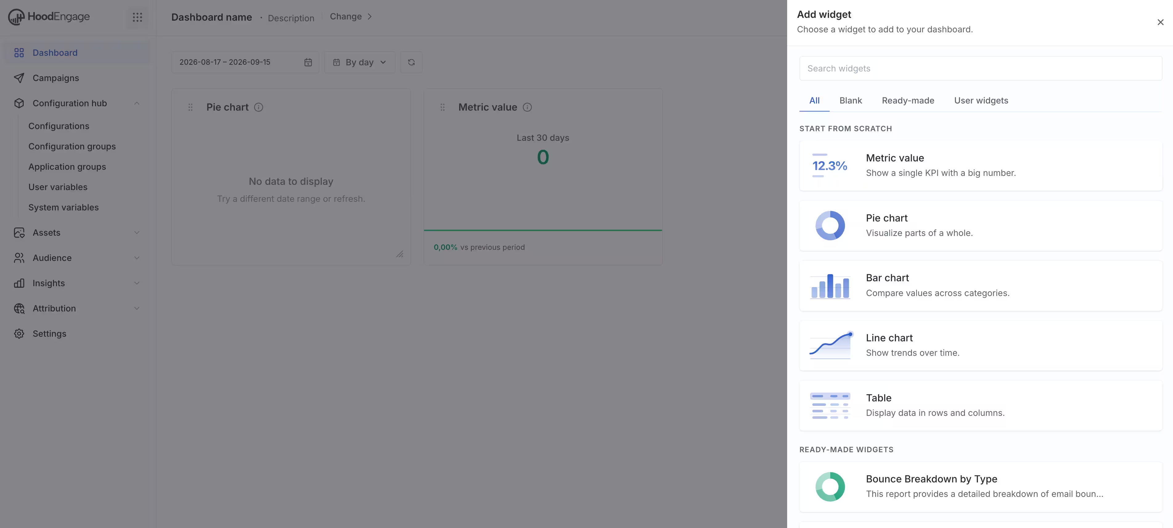
Add widget list
Once a widget is added, you can drag it to position it anywhere on the dashboard. Some widgets can also be resized by dragging their borders; not all widget types change size this way.
Each widget has controls in its header:
- an edit button to edit that widget;
- Settings;
- Delete, to remove the widget from the dashboard.
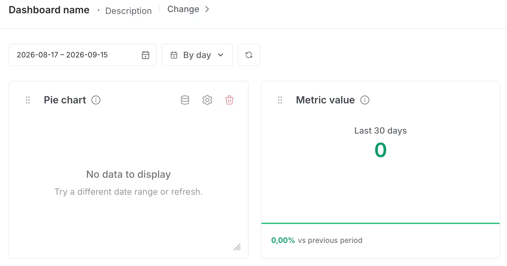
Widget controls
Click Settings to open Widget configuration. Here you can:
- set the Widget title;
- set the Description;
- turn Show chart on or off;
- turn Lock widget position on or off, to keep the widget from being moved.
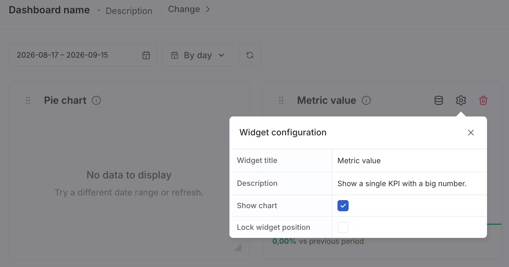
Widget configuration
Once you add all widgets, click the Save button in the top right corner to save your dashboard widget preferences.
Create custom widget
To create a custom widget, click on the Create button in the top right corner of the Add widget form.
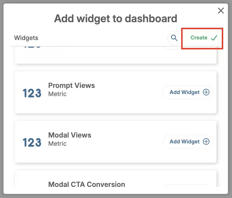
Create custom widget
Here, you can choose (on the right):
- Widget type: Choose among 5 types of pre-defined widget types.
- Widget name: Give your widget a name (mandatory);
- Widget description: Provide a description for your widget (optional);
- Show legend as: Display data in a list or table form. This option changes depending on the widget type;
- Legend position: Bottom or right;
- Legend value: This option gives you additional options for data customization. Legend Value: Choose from Min, Max, Average, or Total.;
- Compare to: Compare the selected period with Previous Period or Previous Week.
On the left, there are:
- Preview (dynamic);
- Data source: Choose the engine that will run the widget from the available selection in the drop-down menu;
- Filter: Drag and drop filters or click on the Add field button for data customization.
Complete Confirm to complete the process.
Here’s an example of a custom widget on the dashboard.
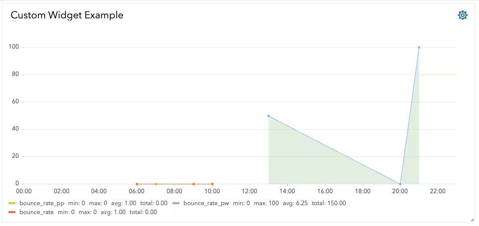
Custom widget example
Widget Types
There are 5 types of pre-created Widgets.
Timeline
- Show Legend As: Display data in a list or table form.
- Legend Position: Opt for bottom or right-side positioning.
- Legend Value: Choose from Min, Max, Average, or Total.
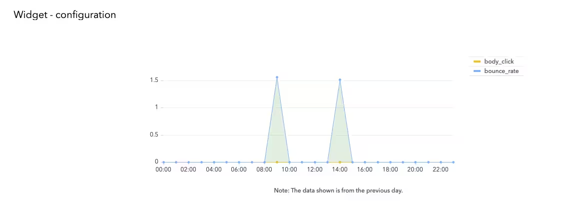
Dashboard timeline widget example
Compare To: Compare the selected period with Previous Period or Previous Week.
Metric
- Sparkline Graph: Choose between None or Area.
- Compare To: Compare the selected period with Previous Period or Previous Week.
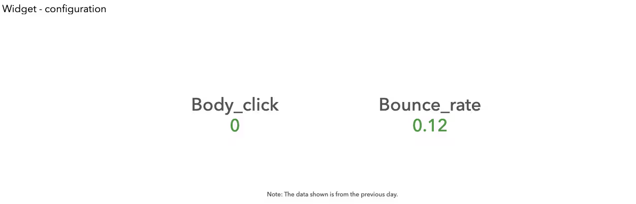
Dashboard metric widget example
Table
- Order Field: Sort data by the selected field.
- Order By: Choose sorting order between ascending or descending.
- Show Table With: Select the number of rows to display (5 or 10 rows).
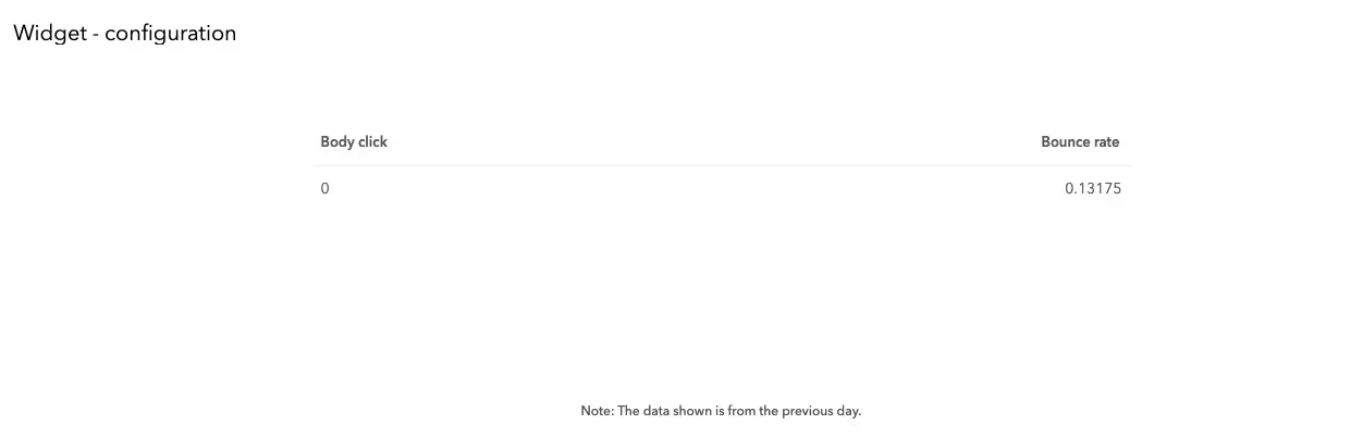
Dashboard table widget example
World map
- Order Field: Sort data by the selected field.
- Order By: Choose sorting order between ascending or descending
- Show Legend With: Define the number of rows to display (5 or 10 rows).
- Show Legend As: Opt for a list or table form.
- Legend Position: Position legend data in relation to the graph (bottom or right).
- Legend Value: Choose data display mode between percent or value.
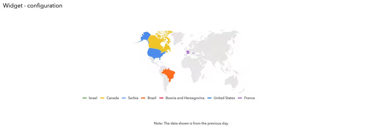
Worldmap widget example
Pie
- Piechart Type: Display data as pie or donut.
- Piechart Labels: Show data based on value, percent, or name.
- Label Position: Display data inside or outside the pie/donut.
- Show Legend As: Choose between a list or table form.
- Legend Position: Position legend data in relation to the pie (bottom or right).
- Legend Value: Choose data display mode between percent or value.
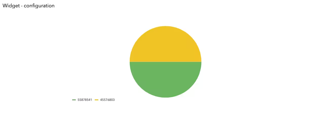
Pie widget example